Pantone Reveals Color of the Year for 2015
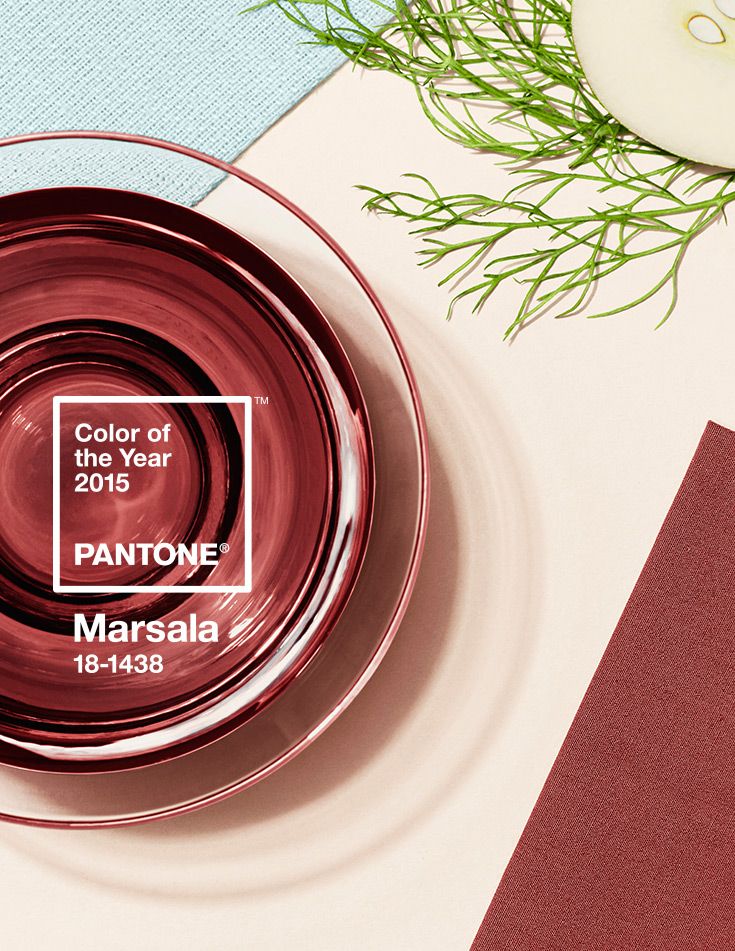
“Much like the fortified wine that gives Marsala its name, this tasteful hue embodies the satisfying richness of a fulfilling meal, while its grounding red-brown roots emanate a sophisticated, natural earthiness,” said Leatrice Eiseman, executive director of the Pantone Color Institute®.
Marsala in Graphic Design
A rich contrasting color, Marsala is ideal for use in graphic design and packaging. Eye-catching, but not overwhelming or bright, consumers are immediately drawn to the hue, making it an alluring shade at point-of-purchase. As packaging becomes increasingly more artistic, Marsala will be a natural fit for both high- and low-tech materials, including on-shelf periodicals as well as printed assets, like calendars and stationery.
More information is available at www.pantone.com.